
Now, Python and R are the commonly used languages for the statistical computing, but these are not easy to learn and use for the business users (marketers, analysts, etc).
Several months ago we introduced R visuals for Power BI. Using Power BI, you can now easily combine your real data (business data) with a few lines of code, and share that visuals for other users without any additional setup. Moreover, the ISV folks can also use these visuals in your own custom apps using Power BI Embedded.
In this post, I show you an example powered by R for beginner’s understanding.
As I describe here, we reuse the existing data, scripts, and visuals. Even if you are not a programmer or scientist, you can modify the complete script (complete sample) and see how the results are shown very quickly.
Note : Developers can also contribute R enabled custom visuals for the end users. (The R packages can be installed as part of the visual download process, and the users can use the visuals without any knowledge of R.) Here I cannot describe about this.
Note (Aug 2018) : Now you can also use Python scripts in Power BI Desktop. (See “Python integration” in this team blog’s post for details. Now in Preview !)
Install R runtime and Power BI
When the user views the R enabled Power BI report on the web, the user needs only the web browser (Power BI service account) and no additional components are needed on the local computer.
But, when you author the R enabled Power BI report, you must use Power BI Desktop and R runtime (or Microsoft R Open, which gives multithreading and high performance based on the open R). In this post, we edit the existing R visuals and see how it works, then you must install these components in your local computer.
Then Power BI Desktop automatically detects the installed R runtime, when it opens. (The only thing you need to do is just installation of Power BI Desktop and R runtime !)
Install R packages
For start-up users, here are the Microsoft and community contributed several examples, and you can open and see how it works using Power BI.
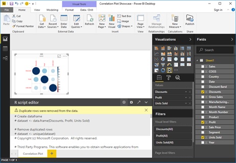
Now, let’s use the most simple example “Correlation Plot” in this showcase.
Power BI – R Script Showcase
http://community.powerbi.com/t5/R-Script-Showcase/bd-p/RVisuals
Please download the Power BI file (.pbix) of the “Correlation Plot” sample, and open this file using your Power BI Desktop.
First you notice that the error in Power BI report is shown, because the required R packages are not installed.
In this example, only the package called “corrplot” is used, and then you must install this package using R console. (See the following command.)
Note : You can also download the package installation script from the showcase site and can install required packages using this script.
Note : If you don’t have permissions for the R installation location, the personal library is used for the package installation location. In Windows, {your user profile location}DocumentsRwin-library{version} is used by default.
install.packages("corrplot", repos="http://cran.us.r-project.org")Note that the following document is describing the supported R packages in Power BI Service (Power BI on the web). All the previous showcase examples only use these supported packages.
The supported R packages in Power BI service
https://powerbi.microsoft.com/en-us/documentation/powerbi-service-r-visuals/
The following script removes the installed package. Please fill the appropriate values in {your profile location} and {version}.
remove.packages("corrplot", lib="{your profile location}\Documents\R\win-library\{version}")After installing the packages, you can now view the R enabled report in your Power BI Desktop as follows.
Source data and data frame
Before you see and modify R scripts, please check your input data and dataset. The data is imported from the data source and resides in this pbix file. Then you can easily see the source data using this pbix file.
First you must understand what columns are used for this R visual. In this example, “Discounts”, “Profit”, and “Units Sold” are used.
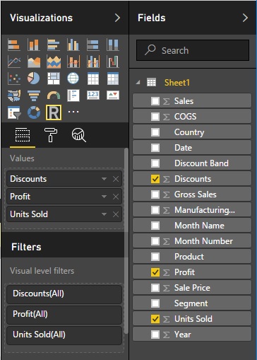
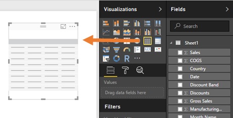
When you want to see the data in these columns, please insert the table into this report and drag these columns into the “Values” area in this table. (See the following screenshot.)
You can see a lot of source data in this table, or you can export data to CSV.

This data (2 dimension vector) is also referenced as “dataset” in the R script on Power BI.
For example, if you write the following R script in the editor, you can see this data frame (named “dataset”) as the table format. (Sorry, but not all the data is displayed or scrolled.)
Note : Please install the “gridExtra” package and the dependent package called “gtable” beforehand.install.packages("gtable", repos="http://cran.us.r-project.org")install.packages("gridExtra", repos="http://cran.us.r-project.org")
library(gridExtra)grid.table(head(dataset))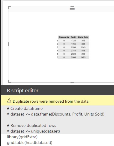
See what the R script does (very simple !)
Let’s see the R script in the Power BI R script editor. It’s so long script, but don’t mind ! Almost all is preparing parameters (arguments), comments, and error handlings.
Only the following is the essence of this script. Please copy and paste into your editor, and run. As you can see, the same graph (visual) is shown in the report.
require("corrplot", character.only = TRUE)M <- cor(dataset, use="pairwise.complete.obs")corrplot(M, method='circle', order='original', type='full', addrect=2, mar=c(0.5, 0.25, 0.25, 0.1) + 0.5, tl.col="red", tl.cex=0.95, number.digits=1, number.cex=0.6, addCoef.col=NULL)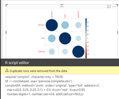
The function “cor” is analyzing the correlation of these columns, and the result is set in the variable called “M”. Then the function “corrplot” plots this result as visuals in the canvas. (Please see the function reference for the details of the parameters.)
For example, let’s consider the following dataset. As you see, “Discounts” and “Units Sold” is completely dependent. Assuming that the unit price is 500 and the prime cost is all 0 (i.e, the selling is all for profits), you can also find that “Profits” is also strongly dependent in this case. As a result, the graph (visuals) is shown as the following screenshot.
Of course, this is the very extreme case …
dataset <- data.frame( "Discounts" = c(100,200,300,200), "Profits" = c(60000,90000,90000,90000), "Units Sold" = c(150,300,450,300))require("corrplot", character.only = TRUE)M <- cor(dataset, use="pairwise.complete.obs")corrplot(M, method='circle', order='original', type='full', addrect=2, mar=c(0.5, 0.25, 0.25, 0.1) + 0.5, tl.col="red", tl.cex=0.95, number.digits=1, number.cex=0.6, addCoef.col=NULL)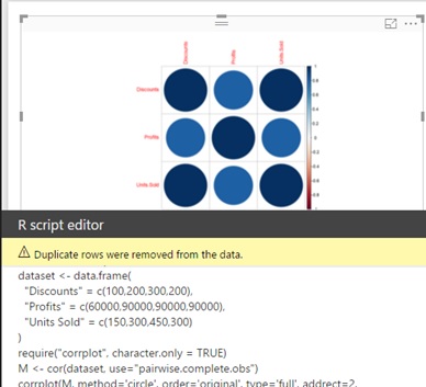
The R of Power BI is not distributed, not clustered, not batched, or not streaming like the professional developing platforms. But the business users (marketers, analysts, etc) can easily retrieve data from the existing web (html table), files, database, services, and analyze quickly by the rich operations like correlation, clustering, statistical forecasting, etc, and share the visuals in a casual way.
There exist other so many useful samples in R Script Showcase. Take it easy and enjoy R with Power BI !

[Reference] Create Power BI visuals using R (official document)
https://powerbi.microsoft.com/en-us/documentation/powerbi-desktop-r-visuals/
Categories: Uncategorized

Why isn’t all the data displayed when using the below?
library(gridExtra)
grid.table(head(dataset))
LikeLike