
2016/09 : This is an old post and please see “Build Your Custom Visuals in Power BI” as new one.
この投稿は古い情報です。最新の情報については「Build Your Custom Visuals in Power BI」を参照してください。
Power BI を使った開発
- Custom Visual 開発 (Visual Studio, Node.js 編)
- Custom Visual 開発 (Power BI Developer Tools 編)
- UI の iframe による表示 (統合)
- REST API を使ったデータ連携
- Power BI Embedded を使ったアプリ開発
こんにちは。
以前投稿した「Power BI の Custom Visual 開発 (Visual Studio, Node.js)」(タイトルが今回とかぶるので変更しました。。。) では、Custom Visual (Custom Report) 開発の Preview が出た当初で、一般の開発者が使うにはとても高いハードルがありました。(Visual Studio を使って開発し、Power BI の MS Product 自体に反映 (Contribution) するというものでした。)
現在、Power BI では、Tool, Export, Upload, Gallery などの仕組みが整い、もっと Light に、Custom Visual を個人で利用したり、簡単に共有する仕組みなどが利用できます。
今回は、前回の続編として、改めて、この新しい Custom Visual の作成、配布、利用について紹介します。
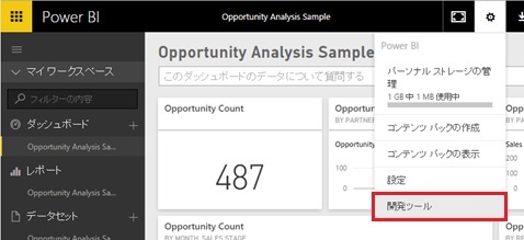
Developer Tools の起動
新しい Custom Visual 開発では、Node.js や Visual Studio によるセットアップではなく、Browser ベースの開発環境が利用可能できます。
Power BI Dashboard (https://powerbi.com/) にログインして管理メニューを選択すると、[開発ツール] (Dev Tools) というメニューがあるので、これを選択するだけで、Browser の開発者ツール (Developer Tools) が起動します。(現在、Preview です。)
以降は、このツールで開発をおこないますが、実は、開発の概念自体は、前回解説した「Power BI の Custom Visual 開発 (Visual Studio, Node.js)」とほぼ同様です。(一部では、同じ Github リポジトリーのソースも使用されています。)
大部分は繰り返しになりますが、再度、この開発のアウトラインを下記で解説しましょう。
DataView
Power BI では、取得したデータに Pivot などの操作をおこない集計し (データモデルを作成し)、この集計結果を Visual 化しますが、この集計されたデータは DataView と呼ばれ、以下の要素を含んでいます。(これらを複合的に持たせることができます。逆に、必ず、これらの型のいずれかに当てはめられます。)
- Categorical
- Table
- Tree
- Matrix
- Single
例えば、今回サンプルで使用する SalesByDayOfWeekData は、月曜 (Monday) から日曜 (Sunday) までの Sales1, Sales2 の売り上げを表現しており、下記のような Json フォーマットのデータとして Custom Visual (JavaScript) に渡されます。(下記の通り、metedata, categorical, table を持っています。)
こうした構造は、Custom Visual の開発で不可欠なので、おぼえておきましょう。(少々長いデータですが、Json Parser などに下記を貼り付けて大枠の構造を眺めてみてください。)
なお、後述しますが、この DataView は 1 つのサンプルに過ぎず、細かなレイアウト情報 (下記の metadata の詳細や、データの種類の数、objects 内にある format 情報等々) は、後述する Visual Capability で定義されます。しかし以降は、いきなり話を複雑にしないために、下記フォーマットの前提でプログラムを書いていきます。
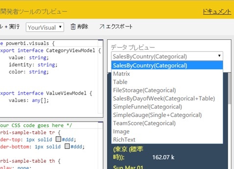
{ "metadata": {"columns": [ {"displayName": "Day","queryName": "Day","type": { "underlyingType": 1, "category": null} }, {"displayName": "Previous week sales","isMeasure": true,"format": "$0,000.00","queryName": "sales1","type": { "underlyingType": 259, "category": null},"objects": { "dataPoint": {"fill": { "solid": {"color": "purple" }} }} }, {"displayName": "This week sales","isMeasure": true,"format": "$0,000.00","queryName": "sales2","type": { "underlyingType": 259, "category": null} }] }, "categorical": {"categories": [ {"source": { "displayName": "Day", "queryName": "Day", "type": {"underlyingType": 1,"category": null }},"values": [ "Monday", "Tuesday", "Wednesday", "Thursday", "Friday", "Saturday", "Sunday"],"identity": [ {"_expr": { "kind": 0, "left": {"source": { "schema": "s", "entity": "table1"},"ref": "day of week" }, "right": {"type": { "underlyingType": 1, "category": null},"value": "Monday","valueEncoded": "'Monday'" }},"_key": { } }, {"_expr": { "kind": 0, "left": {"source": { "schema": "s", "entity": "table1"},"ref": "day of week" }, "right": {"type": { "underlyingType": 1, "category": null},"value": "Tuesday","valueEncoded": "'Tuesday'" }},"_key": { } }, {"_expr": { "kind": 0, "left": {"source": { "schema": "s", "entity": "table1"},"ref": "day of week" }, "right": {"type": { "underlyingType": 1, "category": null},"value": "Wednesday","valueEncoded": "'Wednesday'" }},"_key": { } }, {"_expr": { "kind": 0, "left": {"source": { "schema": "s", "entity": "table1"},"ref": "day of week" }, "right": {"type": { "underlyingType": 1, "category": null},"value": "Thursday","valueEncoded": "'Thursday'" }},"_key": { } }, {"_expr": { "kind": 0, "left": {"source": { "schema": "s", "entity": "table1"},"ref": "day of week" }, "right": {"type": { "underlyingType": 1, "category": null},"value": "Friday","valueEncoded": "'Friday'" }},"_key": { } }, {"_expr": { "kind": 0, "left": {"source": { "schema": "s", "entity": "table1"},"ref": "day of week" }, "right": {"type": { "underlyingType": 1, "category": null},"value": "Saturday","valueEncoded": "'Saturday'" }},"_key": { } }, {"_expr": { "kind": 0, "left": {"source": { "schema": "s", "entity": "table1"},"ref": "day of week" }, "right": {"type": { "underlyingType": 1, "category": null},"value": "Sunday","valueEncoded": "'Sunday'" }},"_key": { } }] }],"values": [ {"source": { "displayName": "Previous week sales", "isMeasure": true, "format": "$0,000.00", "queryName": "sales1", "type": {"underlyingType": 259,"category": null }, "objects": {"dataPoint": { "fill": {"solid": { "color": "purple"} }} }},"values": [ 742731.43, 162066.43, 283085.78, 300263.49, 376074.57, 814724.34] }, {"source": { "displayName": "This week sales", "isMeasure": true, "format": "$0,000.00", "queryName": "sales2", "type": {"underlyingType": 259,"category": null }},"values": [ 123455.43, 40566.43, 200457.78, 5000.49, 320000.57, 450000.34] }] }, "table": {"rows": [ ["Monday",742731.43,123455.43 ], ["Tuesday",162066.43,40566.43 ], ["Wednesday",283085.78,200457.78 ], ["Thursday",300263.49,5000.49 ], ["Friday",376074.57,320000.57 ], ["Saturday",814724.34,450000.34 ], ["Sunday",null,null ]],"columns": [ {"displayName": "Day","queryName": "Day","type": { "underlyingType": 1, "category": null} }, {"displayName": "Previous week sales","isMeasure": true,"format": "$0,000.00","queryName": "sales1","type": { "underlyingType": 259, "category": null},"objects": { "dataPoint": {"fill": { "solid": {"color": "purple" }} }} }, {"displayName": "This week sales","isMeasure": true,"format": "$0,000.00","queryName": "sales2","type": { "underlyingType": 259, "category": null} }] }}開発者ツール (Developer Tools) 上では、あらかじめ使用できる DataView がいくつか用意されており、これらを使って実際に Visual (UI) を見ながら開発できるようになっています。(下図参照)
下記の SalesByDayOfWeekData (5 番目の DataView) が上記の DataView であり、今回は これを使って開発 (プログラミング) します。
IVisual による描画
開発者ツール (Developer Tools) では、コード (Typescript, CSS) を記述して、右に実行結果としてのビューを確認できるようになっています。以降では、開発者ツール (Developer Tools) の左ペイン上で、Visual (UI) 作成をおこなうコードを記述してみましょう。
Custom Visual では、下記の IVisual の class (typescript の class)を実装して、DataView の Visualize をおこないます。
実装すべきメソッドは下記の init, update のみで、ここに、初期化と (グラフ等の) 描画の処理を記述します。
export class YourVisual implements IVisual {public static capabilities: VisualCapabilities = {... };public init(options: VisualInitOptions): void {... }public update(options: VisualUpdateOptions) {... }}描画領域は init や update の引数で渡される options (VisualInitOptions クラス) を使って options.element.get(0) で取得でき、DataView (上述の入力データ) は options.dataViews[0] で取得できます。
例えば、下記の通りコード (typescript) を見てください。
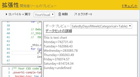
ここでは、上記の DataView の table の 1 列目 (曜日) と 2 列目 (Sales1 の Revenue) のデータを Text で出力しています。(まずは、超簡単なサンプルからはじめてみましょう。)
export class YourVisual implements IVisual { private drawArea: HTMLElement; public static capabilities: VisualCapabilities = { }; public init(options: VisualInitOptions): void {// "this" scope will changevar _this = this;var captionArea = document.createElement("div");captionArea.innerHTML = "This is test chart";options.element.get(0).appendChild(captionArea);_this.drawArea = document.createElement("div");options.element.get(0).appendChild(_this.drawArea); } public update(options: VisualUpdateOptions) {// "this" scope will changevar _this = this;// Debug://_this.drawArea.innerHTML =// JSON.stringify(options.dataViews[0]);_this.drawArea.innerHTML = "";for (var i = 0; i < options.dataViews[0].table.rows.length; i++) { var row = options.dataViews[0].table.rows[i]; _this.drawArea.innerHTML += row[0] + "=" + row[1] + "";} }}開発者ツール (Developer Tool) で [コンパイル + 実行] (Compile + Run) をクリックすると、下図の通り、右ペインに、実行結果として Visual (Report, UI) が表示されます。
上記は Trivial なサンプルですが、開発者ツール (Developer Tools) が既定で提供しているサンプルを見ていただくとわかりますが、Power BI の実際の Visual は、ほとんど d3.js を使って構築されています。
この手の Visualization に適したさまざまな関数も提供されていますし、更新データの再描画、アニメーション効果など、Visualization で必要な細やかな制御も数行で書けるので、現実の開発では、d3 を使用したほうがはるかに開発効率が高くなりますね。
例えば、下記は、上記の DataView を読み込み、d3.js を使って単純な棒グラフを表示するサンプル コードです。(ここでは d3 自体の解説は省きますが、下記は、d3 を読める方ならおわかりの通り、それほどむずかしい処理はおこなっていません。)
なお、今回は、ソースコードが煩雑にならないように処理を省略していますが、現実の開発 (プログラミング) では、例えば、DayOfWeek や Sales 以外のデータが指定された場合でも扱えるように、DataView の metadata などから動的に情報を取得して処理をおこなうなどしてください。(慣れてきたら、Developer Tools のサンプルなどをながめてみてください。下記のままでは、まだ公開に堪えない状態のソースコードです。。。)
export class YourVisual implements IVisual {private svg: D3.Selection;private margin = { top: 20, right: 20, bottom: 100, left: 70 };private height: number;private width: number;public static capabilities: VisualCapabilities = {};public init(options: VisualInitOptions): void {// "this" scope will changevar _this = this; // get height and width from viewport_this.height = options.viewport.height- _this.margin.top- _this.margin.bottom;_this.width = options.viewport.width- _this.margin.right- _this.margin.left;// append svg graphics_this.svg = d3.select(options.element.get(0)).append('svg').attr('width', options.viewport.width).attr('height', options.viewport.height).append('g').attr('transform','translate(' + _this.margin.left + ',' + _this.margin.top + ')');}public update(options: VisualUpdateOptions) {// "this" scope will changevar _this = this; // Debug://_this.drawArea.innerHTML =// JSON.stringify(options.dataViews[0]);// convert data formatvar dat =YourVisual.converter(options.dataViews[0]);// setup d3 scalevar xScale = d3.scale.ordinal().domain(dat.map(function (d) { return d.dayofweek; })).rangeRoundBands([0, _this.width], 0.1);var yMax =d3.max(dat, function (d) { return d.amount + 1000 });var yScale = d3.scale.linear().domain([0, yMax]).range([_this.height, 0]);// remove exsisting axis_this.svg.selectAll('.axis').remove();// draw x axisvar xAxis = d3.svg.axis().scale(xScale).orient('bottom');_this.svg.append('g').attr('class', 'x axis').style('fill', 'black') // you can get from metadata.attr('transform', 'translate(0,' + (_this.height - 1) + ')').call(xAxis).selectAll('text') // rotate text.style('text-anchor', 'end').attr('dx', '-.8em').attr('dy', '-.6em').attr('transform', 'rotate(-90)');// draw y axisvar yAxis = d3.svg.axis().scale(yScale).orient('left');_this.svg.append('g').attr('class', 'y axis').style('fill', 'black') // you can get from metadata.call(yAxis);// draw barvar shapes = _this.svg.selectAll('.bar').data(dat);shapes.enter().append('rect').attr('class', 'bar').attr('fill', 'green').attr('stroke', 'black').attr('x', function (d) {return xScale(d.dayofweek);}).attr('width', 50).attr('y', function (d) {return yScale(d.amount);}).attr('height', function (d) {return _this.height - yScale(d.amount);});shapes.exit().remove();}// convert data as following////[// "Monday",// 742731.43,// 123455.43//],//[// "Tuesday",// 162066.43,// 40566.43//],//...//// -->//// [{"dayofweek" : "Monday", "amount" : 742731.43},// {"dayofweek" : "Tuesday", "amount" : 162066.43},// ...]//public static converter(dataView: DataView): TestItem[] {var resultData: TestItem[] = [];for (var i = 0;i < dataView.table.rows.length;i++) {var row = dataView.table.rows[i];resultData.push({dayofweek: row[0],amount: row[1]});}return resultData;}}export interface TestItem {dayofweek: string;amount: number;}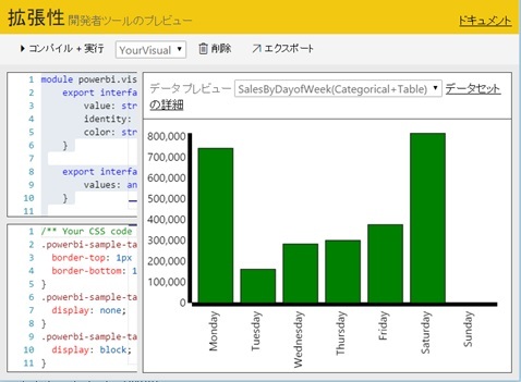
「Power BI の Custom Visual の作成 (Visual Studio, Node.js)」で紹介したプロジェクトにも数多くのサンプルが登録されていますので、是非参照してみてください。(単一の ts ファイルの編集だけですので、開発者ツールを使わず、ローカルの Visual Studio や Visual Studio Code, Node.js などで開発しても構いません。)
デバッグの際は、Browser (Edge, Chrome など) の F12 開発者ツールがそのまま使えます。
Visual Capability
上記で、DataView の Json フォーマットを紹介しましたが、これは 1 サンプルに過ぎず、実際には、上記のサンプルコードで省略していた IVisual の VisualCapabilities 変数を使って、この mapping (metadata の詳細情報、データの種類、objects 内にある format 情報など) を定義します。(また、実際に作った Custom Visual を Import して使用するには、必ず、この VisualCapabilities の実装が必要です。Import の方法は、このあと解説します。)
下記に、非常に簡単なサンプルを記述します。
dataRoles には、どのような種類の入力データを期待するか定義し、それらに名前 (下記の name) を付けています。今回は、Grouping (上記の曜日) と Measure (上記の Sales1) の 2 種類の入力を扱い、それぞれ「Category」、「Y」として定義しています。(metadata には、この名前の role が設定されます。)
dataViewMappings では、それらのデータをどのように抽出するか記述します。(query や条件なども記述可能です。)
objects では、ラベルや dataPoint (今回の場合「Y」) ごとの formatting などが指定可能です。
そして、これらの設定は、すべて DataView に反映されます。
上記のサンプル コード (IVisual の init, update) では、決めた column 名や、決めたフォーマット (色など) を使ってグラフ (Visualization) を描きましたが、実際の開発では、DataView に設定されたこれらの情報に従って描画をおこなうようにして、その mapping 情報は、この VisualCapabilities で定義しておきます。
export class YourVisual implements IVisual { ... public static capabilities: VisualCapabilities = {dataRoles: [ {name: 'Category',kind: powerbi.VisualDataRoleKind.Grouping, }, {name: 'Y',kind: powerbi.VisualDataRoleKind.Measure, },],dataViewMappings: [{ categorical: {categories: { for: { in: 'Category' }, dataReductionAlgorithm: { top: {} }},values: { select: [{ bind: { to: 'Y' } }]}, }}],objects: { general: {displayName: data.createDisplayNameGetter('Visual_General'),properties: { formatString: {type: { formatting: { formatString: true } }, },}, },} }; ...}開発者ツール (Developer Tools) 上では、残念ながら Visual Capabilities の確認 (デバッグ) はできませんが (何を記述しても結果が同じになります)、後述の方法で既存の Report に Import して Visual Capabilities の動きを確認できますので、いろいろと指定してみて、どのような Json (DataView) が渡されるか確認してみると良いでしょう。
詳細は「Github : PowerBI-visuals – Capabilities」を参照してください。(まだ、あまり詳しく書かれていませんが。。。)
Custom Visual の Export
作成した Custom Visual は、Export をおこなうことで、個人や組織 (企業) で再利用したり、Gallery と呼ばれる Community Driven な場所にアップロードして広く公開することなどが可能です。
Custom Visual を Export するには、開発者ツール (Developer Tool) の [エクスポート] (Export) ボタンを押すだけです。
下図のようなフォームが表示されるので、必要事項を入力して [エクスポート] (Export) ボタンを押すと、.pbiviz という拡張子のファイルが Browser からダウンロードされます。
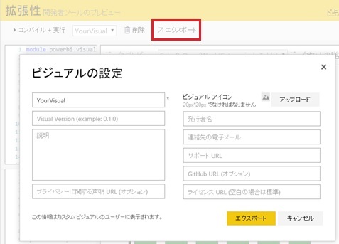
このファイル (.pbiviz) は zip 形式のファイルであり、中身には typescript や compile 後の JavaScript も含む一連のリソースが登録されています。(この中の package.json には、この Custom Visual に関するメタ情報が記述されています。)
つまり、Custom Visual の開発では、この開発者ツール (Developer Tools) を使わずに、例えば、独自の開発フレームワークなどを構築して、この .pbiviz ファイル (成果物) を自動作成することなども可能です。(非常にわかりやすい成果物のフォーマットになっています。)
Custom Visual (.pbiviz ファイル) の Import
Download した Custom Visual (.pbiviz ファイル) は、以下の通り使用できます。
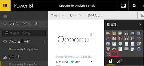
まず、Power BI Dashboard (https://powerbi.com/) で Dashboard を表示して Report を表示し、[レポートの編集] (Edit Report) をクリックして編集モードにします。
表示される [視覚化] (Visualizations) のペイン (右側) の […] アイコンをクリックすると、 .pbiviz ファイル (Custom Visual) の Import が可能です。(下図)
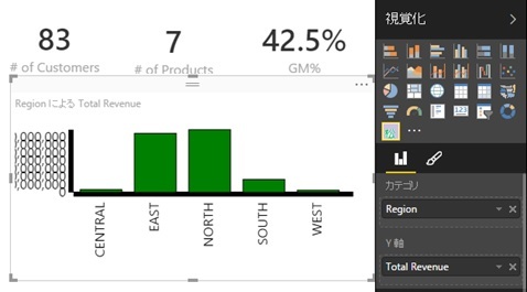
適当に Tile を選択して、Import されたアイコンをクリックすると、下図の通り、データに対して作成した Custom Visual が適用されます。(「そりゃないでしょ」というサンプルですみません。。。あとは、適宜、きれいに作ってください !)
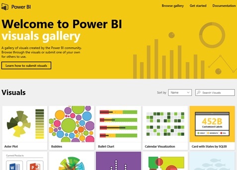
Visuals Gallery による公開
いろいろと他のサンプルを見て、高度な Visual がどのように作られているか確認したいですよね。
実は、Visual Gallery と呼ばれる Community Driven のリポジトリーがあり、ここから好きな Visual (.pbiviz ファイル) の Download や、皆さんが作成した “いけてる” Custom Visual の Submit も可能です。(Submit する際は、下図の [Learn how to submit visuals] をクリックします。)
Power BI Visuals Gallery
https://app.powerbi.com/visuals
前述の通り、ダウンロードされる .pbiviz ファイルは zip ファイルなので、開発者の方は、実際のコードと動きを見ていろいろと学ぶことができる教材としても活用していただけます。
前回も注記しましたが、Power BI のコンセプトは「すべての人に BI を」であり、一般の利用者がこうした使い方をすることはありませんが、ISV の方にとっては、ここで紹介したように、カスタムの BI プラットフォームとして活用していただける機能が整ってきていますので、是非、皆さんのビジネスの部品の一部として活用してみてください。
Categories: Uncategorized
